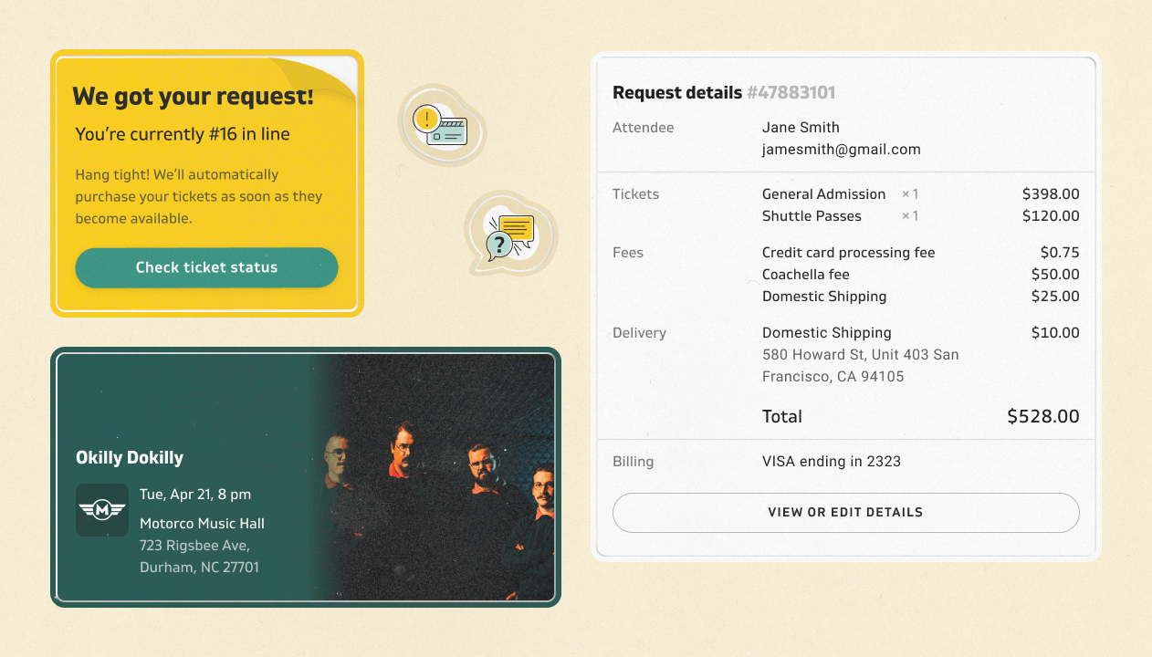
Design System for Email — Modularize variants to improve consistency and efficiency

Emails are the primary touchpoint between Lyte and the fans.  Yet it was neglected as lower priority than products.  Resulting in high operational cost for customer service.

My role: Research, Content strategy, UI/UX design
Platform: Mobile, Desktop
Tools: Figma, Webflow
Timeline: Aug 2019 - Jan 2020

Pain points

Visual Inconsistencies

Multiple email system creates an in-cohesive customer journey with alternating visual styles.  Reducing the trustworthiness of our brand and even causing doubts to authenticity.  

Email mix ups

Ad-hoc and bespoke naming structure caused numerous email mix ups.  Making it hard for effective internal communication and sometimes even resulting in send out wrong emails with broken links.  

High operational cost

The onus of poor email system waterfalls down to our customer service team.  Receiving many preventable complaint letters and requiring human intervention.  

User goal/

Buy

system status/

0-Auth
1-Created
2-Canceled
3-Closed
4-Fulfilled
5-Fulfillment error
6-Delivered

Feature name

Quasar
Request
Request-multitier
Instant
Encore
Swap

Lottery

User goal/

Sell

system status/

0-Auth
1-Created
2-Offered
3-Expired
4-Canceled
5-Closed
6-Pending
7-Remind
8-Fulfilled
9-Delivered
10-Delivery error

Feature name

Return
Return-stacked
Transfer
Transfer-Physical
Send
Swap

Template name

Scalability — Intuitive naming

Building in instructions on how and when to use an email template with intuitive naming architecture. Following the logic of a job story to capture desired outcome, situation and motivation.

Template name
[user goal] / [system status] / [feature name]

Context

Negative situation

Lyte system is attempting to charge the payment Jane provided to purchase tickets she requested but is experiencing an error. Jane is feeling confused and stress cause she doesn't want to lose her tickets.

name

Template: buy_payment_error_request

Subject name: Oops, there was a problem processing your payment

Do

Not to worry! Your tickets are safe and waiting for you! Follow the instruction below to update your payment information within 24 hours. Once we received the update, we’ll send you a confirmation with your tickets.

Don't

We had an error processing your payment. Please update your payment method within 24 hours or you'll lose your tickets.

Support links

How to update my payment?

I’ve updated my payment, when will I be charged again?

Content audit example

Comprehensiveness — Content audit sheet with best practice

By working with the support team, we were able to identify common questions throughout the customer journey. We set up the content audit sheet to help reducing redundant information in every email. And put "Jane" instead of "the customer" in the context to increase empathy.

The desktop version is only available with the browser over 900px wide.

Marketing email

The desktop version is only available with the browser over 900px wide.

Transactional email

Consistency — Enable theming

Lyte sends emails on behalf of our primary ticket sellers.  In order to invoke trustworthiness, our emails have to be themed to individual events. Putting the event theme first and foremost.  

The desktop version is only available with the browser over 900px wide.

Container

Column

CSS
SASS (rem function)
SASS (Spacing function)

8px

rem (8px)

spacing (small)

16px

rem (16px)

spacing (regular)

24px

rem (24px)

spacing (medium)

32px

rem (32px)

spacing (large)

40px

rem (40px)

spacing (xlarge)

Spacing

Display Large

font-size:24px;
line-height:36px;
font-weight:700;

Display Medium

font-size:20px;
line-height:1.6;
font-weight:600;

Display Small

font-size:16px;
line-height:20px;
font-weight:600;

Body

font-size:16px;
line-height:24px;
font-weight:400;
font-size:14px;
line-height:22px;
font-weight:400;
letter-spacing:0.2px;

Typography

Brand
PY70
#009f8a
PY50
#3ccc98
CA50
#FFD400
CA30
#FFED96
Service
S100
#1d1d1f
S60
#7f7f7f
S40
#e5e5e5
Auxiliary
G50
#388E51
G30
#E2F4E4
O50
#FEAF39
O30
#FFEED6
R50
#EF5350
R30
#FFEBEB

Color

Responsiveness — Module variants

Allow senders to mix and match modules and craft new email structures easily.  For example, FAQ can be dynamically adjusted to fix the context of the email.

The foundation

The foundation contains the layout of the email and the unified brand look and feel like color and type scale.

80x80px
60x60px

Images

60px
16px

Icons

Ticket delivered
Requested
Payment error
Canceled

Badge

Elements

Elements showcases the smallest individual pieces of the interface which act as building blocks for components.

The desktop version is only available with the browser over 900px wide.

Header

The desktop version is only available with the browser over 900px wide.

Footer

The desktop version is only available with the browser over 900px wide.

Content card

The desktop version is only available with the browser over 900px wide.

Event card

The desktop version is only available with the browser over 900px wide.

Ticket

The desktop version is only available with the browser over 900px wide.

Receipt

Components

Independent and repeatedly used pieces of the interface built out of elements. Each component has its own purpose and correlating content type.

Credits and thanks to

Yauhen, Amadeo, Design team
Innie, Alex Z, Alexey, Sasha, Engineering team
Alexandra, Danielle, Customer support team